
The current payment confirmation dialog could be more clear what amounts are spent for what.
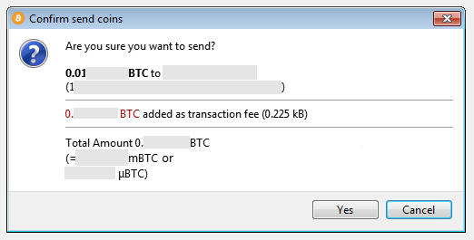
I find this information hard to comprehend. There are numbers in many places, many fonts, random layout. Also, why is the fee red? This is the most unimportant information here and fee accidents are extremely rare. I'm not opposed to outputting mBTC although I personally find that not useful. the numbers should be fixed width 8 decimal digits with thousands separators in my opinion (but the ticket is not primarily about that and my proposals are compatible with any number format).
Here's a strawman proposal:
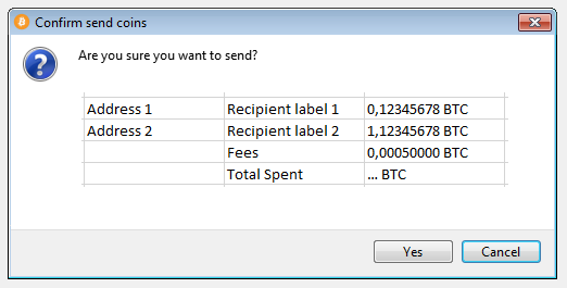
This would require some kind of table layout due to the dynamic number of rows and the varying column widths. If this is too much work, I propose:
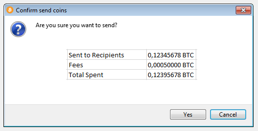
This is a fixed layout.