gui: fix font inconsistency on send coins form #18313

pull za-kk wants to merge 1 commits into bitcoin:master from za-kk:march-gui-font changing 1 files +0 −1
  1. za-kk commented at 10:16 PM on March 10, 2020: contributor

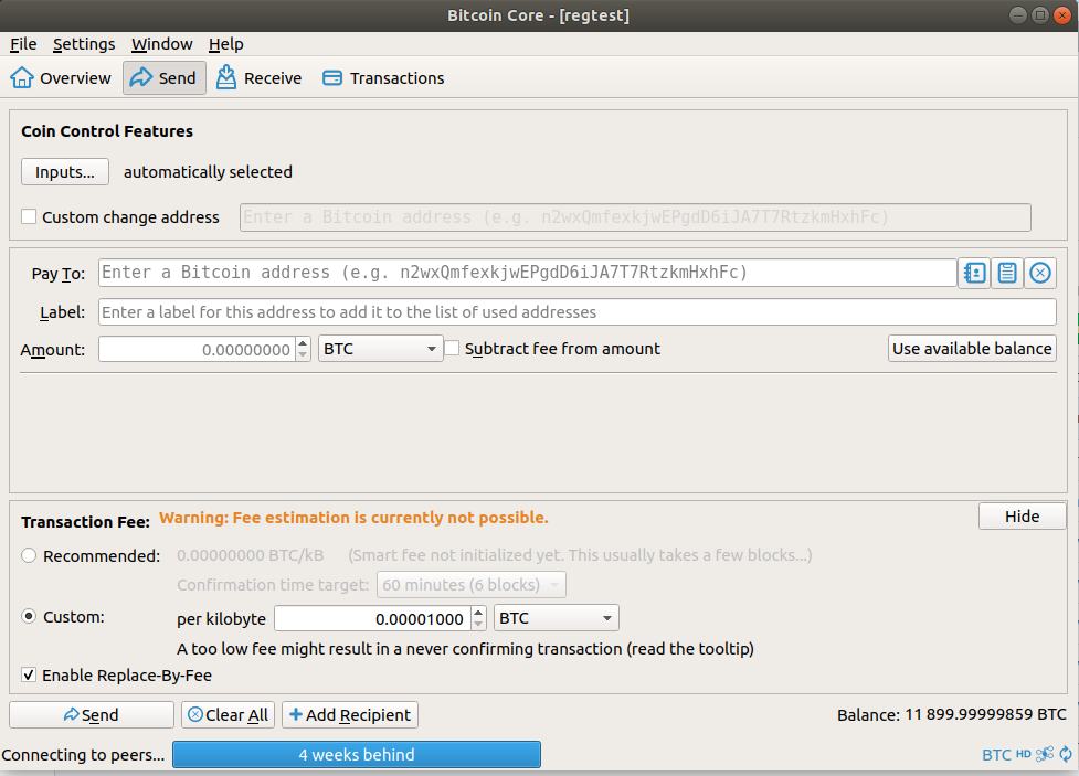
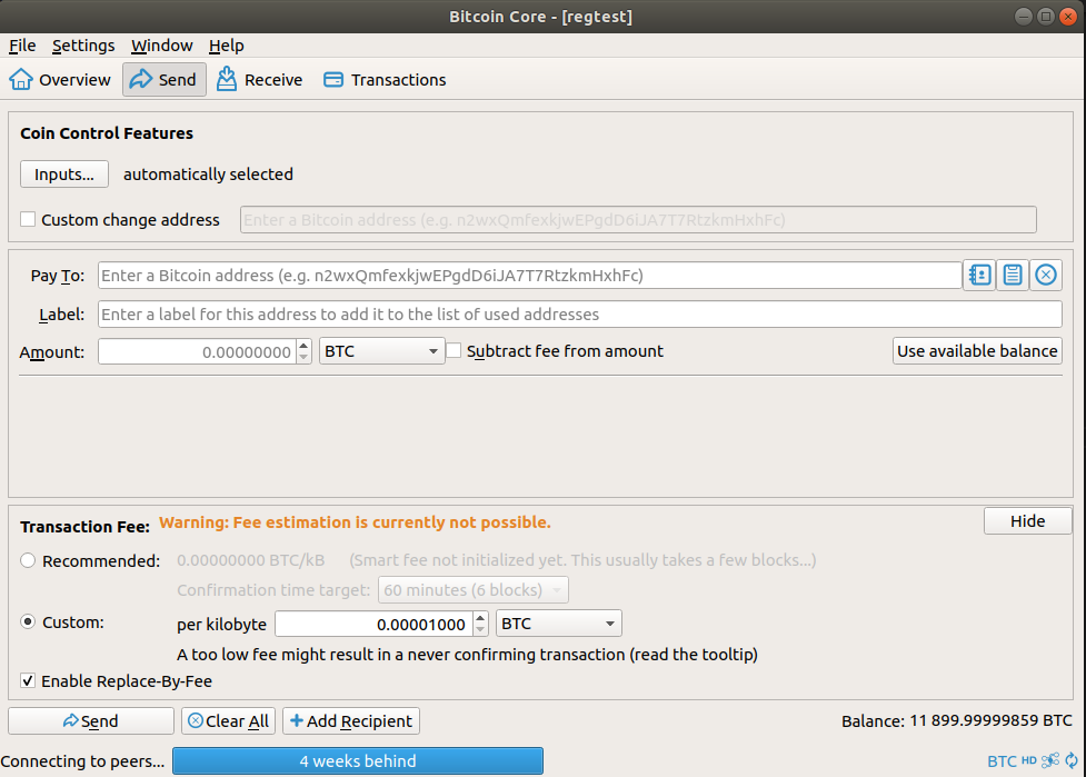
    Small change to the QT font when displaying the address input on the 'Send' tab of the GUI to make it consistent with the rest of the form

    This change involved removing the setFont function from being called in setupAddressWidget meaning it should use the default font instead

    setupAddressWidget is also called on the following files:

    • editaddressdialog.cpp
    • sendcoinsdialog.cpp
    • sendcoinsentry.cpp
    • signverifymessagedialog.cpp

    This change works on all the above QT pages and helps neaten up the font consistency.

    Linux Screenshots

    master before

    pr after

    Mac Screenshots

    master <img width="640" alt="before_mac" src="https://user-images.githubusercontent.com/31032215/76364136-613f6480-631c-11ea-98ec-57d3fe9c887b.png">

    pr <img width="640" alt="after_mac" src="https://user-images.githubusercontent.com/31032215/76364148-69979f80-631c-11ea-9b5f-b29141f920e6.png">

  2. remove setFont for font consistency aacc6c8b76
  3. fanquake added the label GUI on Mar 10, 2020
  4. MarcoFalke commented at 10:51 PM on March 10, 2020: member

    How does it look with pasted address?

  5. za-kk commented at 11:00 PM on March 10, 2020: contributor

    How does it look with pasted address?

    Pasted address looks okay, see below...

    Mac Screenshot <img width="885" alt="address" src="https://user-images.githubusercontent.com/31032215/76366774-d44bd980-6322-11ea-8270-f8faaf451dae.png">

  6. hebasto commented at 9:08 AM on March 11, 2020: member

    Concept ~0. I'd prefer to use monospaced fonts to display bitcoin addresses.

  7. promag commented at 2:50 PM on March 11, 2020: member

    Have you seen #6864?

  8. hebasto commented at 3:57 PM on March 11, 2020: member

    @za-kk btw, what is Qt version on your macOS? Did you test another Qt versions?

  9. za-kk commented at 7:53 PM on March 11, 2020: contributor

    Concept ~0. I'd prefer to use monospaced fonts to display bitcoin addresses.

    I understand the personal preference towards monospace for addresses, however I feel there should be some consistency in the basic stylings when dealing with the GUI and the different fonts. I think the current mismatching fonts just clutter and confuse.

    @za-kk btw, what is Qt version on your macOS? Did you test another Qt versions?

    Currently only tested using Qt version 5.13.1

  10. za-kk commented at 7:55 PM on March 11, 2020: contributor

    Have you seen #6864?

    Yes I have taken a look over that PR, seems it was mainly focused on changing the rpc console output to monospace.

    This change should not effect the output in the console (as far as i know) and only the address inputs on the GUI

  11. dannmat commented at 2:30 PM on March 14, 2020: none

    Concept ACK. Using Bitcoin Core currently feels very messy compared to other software. I think we should be keeping user experience in mind and graphical consistencies like this will go a long way.

  12. RandyMcMillan commented at 11:02 PM on March 14, 2020: contributor

    Using the Accessibility Inspector in Xcode as a reference guide toward better UI changes moving forward could be useful. Most UI elements in QT have built in accessibility settings.

    Screen Shot 2020-03-14 at 6 57 04 PM

  13. RandyMcMillan commented at 11:05 PM on March 14, 2020: contributor

    I was looking for a cross platform tool and have found none that are open source and free. At least the Xcode Dev tool is free and conforms to industry standards.

  14. fanquake deleted a comment on Mar 14, 2020
  15. laanwj commented at 2:55 PM on March 19, 2020: member

    Concept ~0. I'd prefer to use monospaced fonts to display bitcoin addresses.

    Same TBH. I like having it in a different font to distinguish addresses from other text. Note that some other wallets do this too when displaying addresses.

    I'm all for accessibility but I don't think this is really an improvement.

  16. luke-jr commented at 10:53 PM on April 22, 2020: member

    I guess monospace doesn't really make sense given that addresses vary in length, but meh.

    From the mac screenshot, it does look ugly as-is, though...

    (Meta: NACK on letting Apple dictate UI outside of macOS)

  17. za-kk commented at 9:38 PM on May 26, 2020: contributor

    I agree with @luke-jr that it doesn't make sense to use monospace fonts for addresses due to the variable length and inconsistency with rest of GUI but I'm not overly passionate on the subject.

    Will close this PR for now unless anyone has any more input on the matter.

    Thanks all for taking the time to look over and provide feedback!

  18. za-kk closed this on May 26, 2020

  19. DrahtBot locked this on Feb 15, 2022

github-metadata-mirror

This is a metadata mirror of the GitHub repository bitcoin/bitcoin. This site is not affiliated with GitHub. Content is generated from a GitHub metadata backup.
generated: 2026-04-21 18:14 UTC

This site is hosted by @0xB10C
More mirrored repositories can be found on mirror.b10c.me