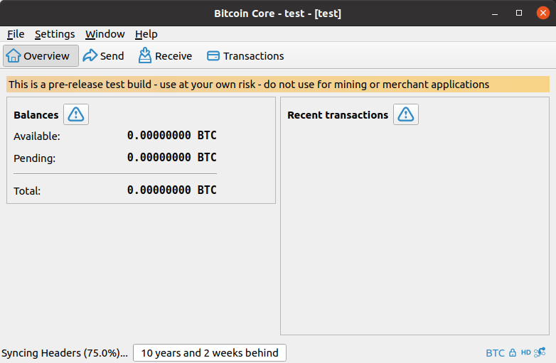
The warning icon on the overview page indicates that there is something important the user should know about, but a user may not be aware that they can click it because, on master, the warning label does not look clickable. As detailed in issue #23, the reason to make it look clickable is that it if they “had a more clickable-appearance (borders or beveled button edges) it could help users more quickly understand what they are being alerted to.”
This PR removes the flat property from both QPushButton’s to make them look like a button, and therefore clickable. Furthermore, it updates the Maximum Width to 45 to fix the small hit-box issue outlined in issue #215.
Below are screenshots showing how the warning icon looks under master and this PR:
macOS 11.1: Qt 5.15
| Master | PR |
|---|---|
Ubuntu 20.04: Qt 5.12
| Master | PR |
|---|---|
 |