Make console buttons look clickable #329

pull jarolrod wants to merge 1 commits into bitcoin-core:master from jarolrod:fix-cb-hitbox changing 2 files +17 −46
  1. jarolrod commented at 11:04 pm on May 14, 2021: member

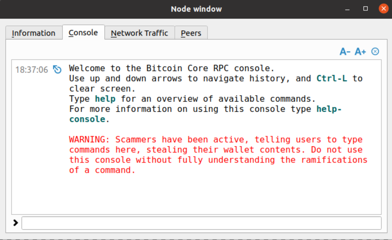
    On master, for macOS, the console buttons’ hitboxes are quite small. This makes clicking on the button with your mouse a little more tedious than it should be. The Issue is related to recent versions of Qt (>5.9.8) not playing so nice on macOS when there are “incorrect” width and height values set for a QPushButton (here is another example: #319#pullrequestreview-652907740).

    This fixes this small hitbox issue by converting the buttons from QPushButton to QToolButton, which in turn makes the buttons look explicitly clickable. This approach was chosen as it helps us avoid having to play around with width and height values until we find values that play nice with macOS and look good on Linux & Windows. Also, QToolButton is an appropriate class for these buttons.

    Per Qt Docs:

    A tool button is a special button that provides quick-access to specific commands or options. As opposed to a normal command button, a tool button usually doesn’t show a text label, but shows an icon instead.

    Since we are changing the type of the buttons, we need to change the respective actions connection logic in rpcconsole. Instead of plugging in QToolButton, we abstract it to the base class: QAbstractButton.

    per Qt Dev Notes

    Use base class functions as this makes the code more general, e.g., use QAbstractButton::clicked instead of QPushButton::clicked.

    While here, we also update the size of the icons to 22x22 to be consistent with other tool buttons.

    macOS: Master vs PR:

    Master PR
    master-ss-macos pr-ss-macos

    Linux: Master vs PR:

    Master PR
    master-ss-linux pr-ss-linux
  2. hebasto added the label UI on May 15, 2021
  3. hebasto commented at 10:41 am on May 15, 2021: member

    Concept ACK on making clickable elements explicit (see #217).

    On master, for macOS, the console buttons’ hitboxes are quite small

    How do your changes increase their sizes?

  4. jarolrod commented at 1:59 pm on May 15, 2021: member

    @hebasto

    How do your changes increase their sizes?

    It seems a better name for this PR would be “Make Console Buttons Look Clickable” as that is what it really does for all systems. The PR was motivated by the small hitbox bug on macOS, this is fixed by making the buttons a QToolButton instead of finding appropriate width and height values for aQPushButton.

  5. qt: make console buttons look clickable
    Change the type for the console's buttons to QToolButton which will make them look explicitly clickable, which in turn fixes the small hitbox issue for macOS.
    With this change, we need to generalize the respective action connect logic from QPushButton to QAbstractButton.
    While here, update width and height of icon for consistency with other tool buttons.
    8b419b5163
  6. jarolrod force-pushed on May 15, 2021
  7. jarolrod renamed this:
    fix console buttons hitbox on macOS
    Make console buttons look clickable
    on May 15, 2021
  8. jarolrod commented at 2:06 pm on May 15, 2021: member

    updated from 05808da -> 8b419b5:

    Changes:

    • Change naming of commit and pr to better represent what the PR is doing
  9. hebasto approved
  10. hebasto commented at 3:26 pm on May 15, 2021: member
    ACK 8b419b5163d41c0caef7b9fa6d3008b73917e8ee, tested on Linux Mint 20.1 (Qt 5.12.8).
  11. promag commented at 11:51 pm on May 24, 2021: contributor
    Not a NACK, personally I think they are fine as is.
  12. promag commented at 10:50 pm on May 31, 2021: contributor

    Tested ACK 8b419b5163d41c0caef7b9fa6d3008b73917e8ee on macOS Big Sur M1, this drops only relevant usages to flat buttons.

    nit, could drop the following: https://github.com/bitcoin-core/gui/blob/aedf71dcc54f56ba8ba93274add2f40ed26cafd4/src/qt/forms/psbtoperationsdialog.ui#L94-L96

  13. promag commented at 11:32 pm on May 31, 2021: contributor

    Played around and with

     0          </item>
     1          <item>
     2           <widget class="QPushButton" name="fontSmallerButton">
     3-           <property name="maximumSize">
     4-            <size>
     5-             <width>24</width>
     6-             <height>24</height>
     7-            </size>
     8-           </property>
     9            <property name="toolTip">
    10             <string>Decrease font size</string>
    11            </property>
    12@@ -490,7 +484,7 @@
    13            <property name="iconSize">
    14             <size>
    15              <width>24</width>
    16-             <height>16</height>
    17+             <height>24</height>
    18             </size>
    19            </property>
    20            <property name="autoDefault">
    

    I get this Screenshot 2021-06-01 at 00 30 31 and when clicking Screenshot 2021-06-01 at 00 30 50 So it seems that maximumSize is screwing the button layout.

  14. hebasto merged this on Jun 5, 2021
  15. hebasto closed this on Jun 5, 2021

  16. sidhujag referenced this in commit a14397b062 on Jun 6, 2021
  17. gwillen referenced this in commit 0314ca181c on Jun 1, 2022
  18. bitcoin-core locked this on Aug 16, 2022

github-metadata-mirror

This is a metadata mirror of the GitHub repository bitcoin-core/gui. This site is not affiliated with GitHub. Content is generated from a GitHub metadata backup.
generated: 2024-11-23 07:20 UTC

This site is hosted by @0xB10C
More mirrored repositories can be found on mirror.b10c.me