recently chatted with a few people about how similar the addrman of 2 nodes might be - that is how much of the ip addresses stored in the addrman of different nodes overlap and we decided to actually measure it. this post compares the addrman of 9 nodes.
TLDR
addrman of 2 nodes tend to be more similar if they support the same networks.
- new table: ~50% similar to each other if they support the same networks
- tried tables vary more (~50% within the 5 clearnet-only nodes, ~37% similarity seen for 2 tor/i2p/clearnet nodes, ~27–33% similarity between tor/i2p node and the 2 tor/i2p/clearnet nodes) and are asymmetric due to large tried table-size differences.
- the ~37% tried similarity for the 2 tor/i2p/clearnet nodes isn’t because they know different addresses but because of different connection choices.
(skip to results)
the addrmen under consideration
all the addrman were downloaded around the same time on may 19. getrawaddrman RPC lets you download addrman in json format. i downloaded some of b10c’s addrman using the endpoint on peer.observer and compared it with my addrman.
summarising node descriptions from peer.observer:(sorted by descending order of number of total entries)
- erin uses clearnet, onion, i2p
- dave uses clearnet, onion, i2p, 1000 inbound
- mike is only outbound connections (listen=0) on clearnet
- alice is full node on clearnet
- nico is knots on clearnet
- frank is blocksonly on clearnet
- bob uses asmap on clearnet
- my node is a full node on clearnet + onion
- kane is onion + i2p only (onlynet=onion,i2p).
addrman consists of 2 tables:
- new table with a theoretical maximum of 65536 entries. usually populated by ADDR/ADDRV2 gossip in the network. similarity in new table between peers would indicate similarity in ADDR relay gossip in the network.
- tried table with a theoretical maximum of 16384 entries. populated by actual successful connections to nodes in the network. similarity in tried table between peers would indicate similarity in a node’s unique connection history which would be strange.
here is the compositions of the new and tried tables of the peers mentioned above for reference:
| peer | number of entries in new table | new table composition | number of entries in tried table | tried table composition |
|---|---|---|---|---|
| alice | 65,534 | ipv4 79% / ipv6 21% | 9,837 | ipv4 100% |
| bob | 65,533 | ipv4 79% / ipv6 21% | 8,251 | ipv4 100% |
| frank | 65,535 | ipv4 79% / ipv6 21% | 8,299 | ipv4 100% |
| mike | 65,482 | ipv4 80% / ipv6 20% | 10,920 | ipv4 100% |
| nico | 65,530 | ipv4 78% / ipv6 22% | 8,647 | ipv4 100% |
| dave | 65,534 | ipv4 61% / ipv6 12% / onion 24% / i2p 3% | 12,429 | ipv4 49% / onion 38% / i2p 13% |
| erin | 65,532 | ipv4 61% / ipv6 11% / onion 24% / i2p 3% | 12,650 | ipv4 48% / onion 39% / i2p 13% |
| kane | 62,535 | ipv4 38% / ipv6 6% / onion 42% / i2p 14% | 10,550 | ipv4 19% / onion 54% / i2p 28% |
| my node | 65,450 | ipv4 66% / ipv6 14% / onion 20% | 7,726 | ipv4 67% / ipv6 2% / onion 32% |
*a handful of cjdns entries in tried tables are not shown above - frank has 7, mike has 1, erin has 3, kane has 2.
*kane’s addrman contains very old clearnet entries probably from an old configuration?
similarity metrics
% similarity is calculated by comparing only the ip addresses. ex: 100.10.90.1:8333 and 100.10.90.1:8339 are considered the same since they have the same ip address even though ports might differ.
if you compare alice’s addrman and bob’s addrman, alice ∩ bob means IP addresses present in both addrman tables.
- for alice: % similarity = len(alice ∩ bob) / len(alice)
- for bob: % similarity = len(alice ∩ bob) / len(bob)
since the new table size is roughly the same for all peers, there won’t be much of a difference in how similar alice finds her new table when compared to bob ([alice, bob] cell in the similarity calculation for new table below) and how similar bob finds his new table when compared to Alice ([bob,alice] cell in the similarity calculation for new table below).
the new table similarity calculation table below is kind of symmetric.
however there is a huge difference in tried table size among the nodes. so you will find the tried table similarity calculation table below not symmetric at all! maybe we should measure it some other way.
since bob has a smaller tried table compared to alice, % similarity for bob would be more - that is bob finds his tried table ~54% similar to alice, whereas alice finds her tried table only ~45% similar to bob (she has a larger tried table!).
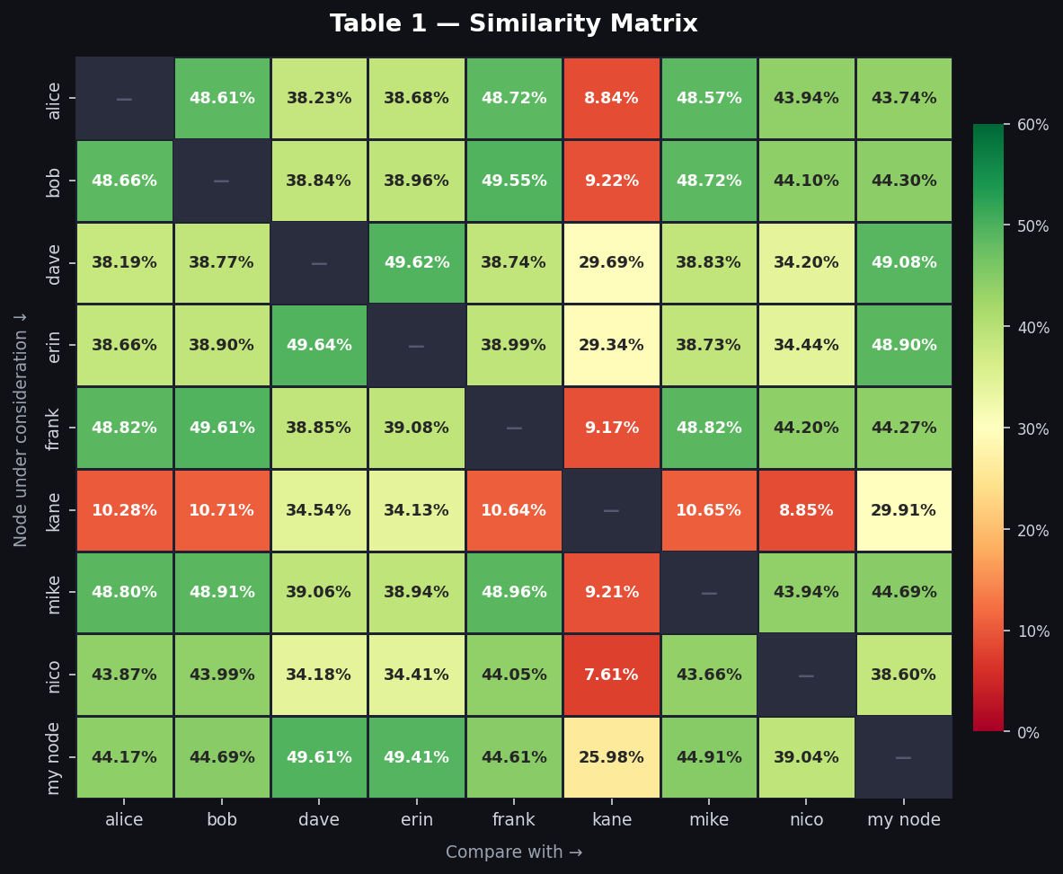
1. new table similarity
- alice, bob, frank, mike, nico have ~ 44 - 50% similar new table
- dave, erin have ~50% similar new table with each other.
- my node lies somewhere in between both clusters ~45% with cluster alice & friends, ~50% with dave and erin
- kane has ~8–11% similar new table with alice & friends cluster (remnant from a previous config), and ~29–34% similar new table with dave and erin.
| node under consideration\compare with | alice | bob | dave | erin | frank | kane | mike | nico | my node |
|---|---|---|---|---|---|---|---|---|---|
| alice | x | 48.61% | 38.23% | 38.68% | 48.72% | 8.84% | 48.57% | 43.94% | 43.74% |
| bob | 48.66% | x | 38.84% | 38.96% | 49.55% | 9.22% | 48.72% | 44.10% | 44.30% |
| dave | 38.19% | 38.77% | x | 49.62% | 38.74% | 29.69% | 38.83% | 34.20% | 49.08% |
| erin | 38.66% | 38.90% | 49.64% | x | 38.99% | 29.34% | 38.73% | 34.44% | 48.90% |
| frank | 48.82% | 49.61% | 38.85% | 39.08% | x | 9.17% | 48.82% | 44.20% | 44.27% |
| kane | 10.28% | 10.71% | 34.54% | 34.13% | 10.64% | x | 10.65% | 8.85% | 29.91% |
| mike | 48.80% | 48.91% | 39.06% | 38.94% | 48.96% | 9.21% | x | 43.94% | 44.69% |
| nico | 43.87% | 43.99% | 34.18% | 34.41% | 44.05% | 7.61% | 43.66% | x | 38.60% |
| my node | 44.17% | 44.69% | 49.61% | 49.41% | 44.61% | 25.98% | 44.91% | 39.04% | x |
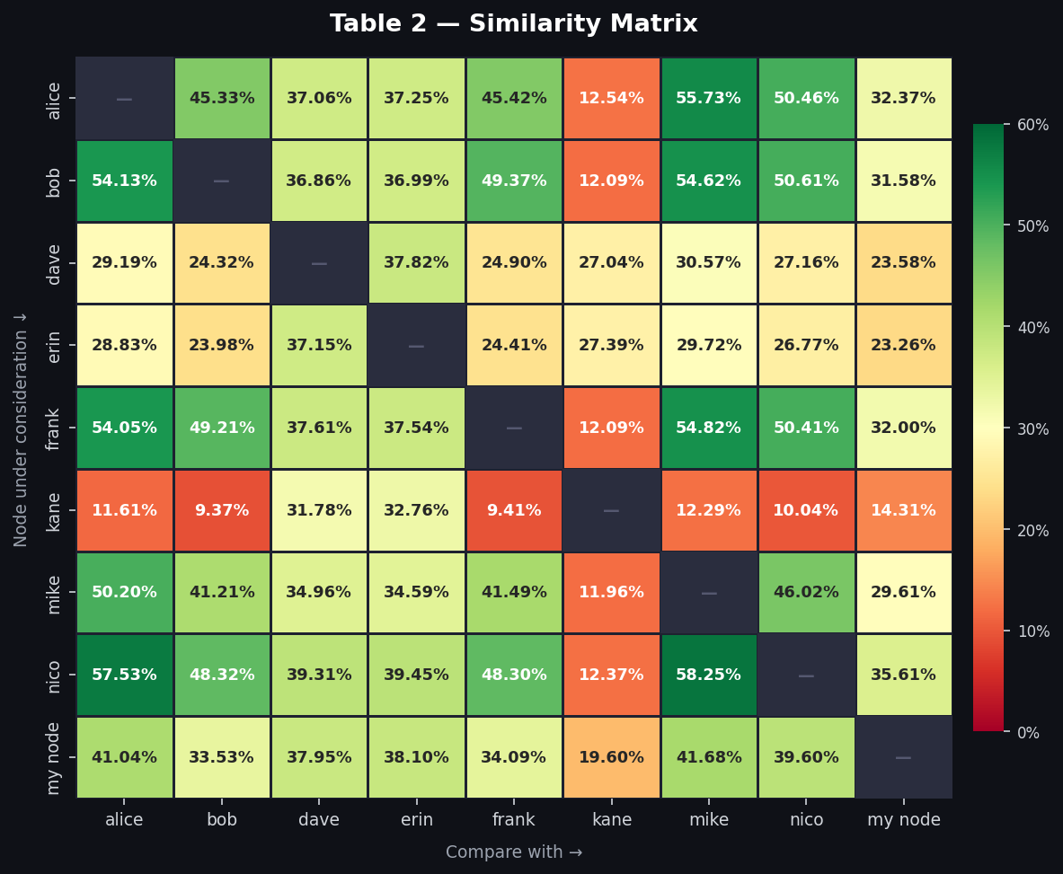
2. tried table similarity
- alice, bob, frank, mike, nico had anywhere from 41 - 58% similar tried table. since tried table size differs a lot, this % metric isn’t that nice as discussed above.
- dave, erin have ~37% similar tried (they kind of have similar tried table size)
- kane has ~9–13% similar tried table with alice & friends (remnants of previous config) and ~27–33% similarity with dave,erin and ~14–20% with my node
- my node doesn’t follow any pattern as well. it has the smallest tried table among all the nodes. 41.68% of it’s tried table addresses are in mike’s tried table as well whereas it has least similarity ~33% with bob. ~33 - 42% similarity with alice and friends and 38% similarity with dave, erin
| node under consideration\compare with | alice | bob | dave | erin | frank | kane | mike | nico | my node |
|---|---|---|---|---|---|---|---|---|---|
| alice | x | 45.33% | 37.06% | 37.25% | 45.42% | 12.54% | 55.73% | 50.46% | 32.37% |
| bob | 54.13% | x | 36.86% | 36.99% | 49.37% | 12.09% | 54.62% | 50.61% | 31.58% |
| dave | 29.19% | 24.32% | x | 37.82% | 24.90% | 27.04% | 30.57% | 27.16% | 23.58% |
| erin | 28.83% | 23.98% | 37.15% | x | 24.41% | 27.39% | 29.72% | 26.77% | 23.26% |
| frank | 54.05% | 49.21% | 37.61% | 37.54% | x | 12.09% | 54.82% | 50.41% | 32.00% |
| kane | 11.61% | 9.37% | 31.78% | 32.76% | 9.41% | x | 12.29% | 10.04% | 14.31% |
| mike | 50.20% | 41.21% | 34.96% | 34.59% | 41.49% | 11.96% | x | 46.02% | 29.61% |
| nico | 57.53% | 48.32% | 39.31% | 39.45% | 48.30% | 12.37% | 58.25% | x | 35.61% |
| my node | 41.04% | 33.53% | 37.95% | 38.10% | 34.09% | 19.60% | 41.68% | 39.60% | x |
interpretation
new table is shaped by ADDR relay gossip (a network phenomenon), so similarity makes sense — though i’d have guessed higher:
- ~50% within the clearnet only cluster (alice, bob, frank, mike, nico)
- ~50% within the clearnet, onion, i2p cluster (dave and erin)
- ~38–39% similarity when comparing both these clusters
- my node sits between them: ~44% with clearnet only, ~49% with dave/erin
- kane has ~29–34% overlap with dave/erin, ~26–30% with my node and ~8–11% with the clearnet cluster
tried table is shaped by each node’s unique connection history. similarity ranges between 9 - 58% and is asymmetric because tried table sizes differ a lot!
- ~50% similarity within the clearnet only cluster (alice, bob, frank, mike, nico).
- ~37% similarity within the clearnet, onion, i2p cluster (dave and erin). this was interesting since they just connected to different subsets of peers despite knowing similar IP addresses. 76% of dave’s tried entries were actually in erin’s addrman.
- when comparing both these clusters: ~37% from the clearnet cluster’s side; ~27% from dave/erin’s side (same intersection set, but dave and erin’s larger tried tables make the % smaller)
- kane: ~27–33% with dave/erin, ~14-20% with my node, ~9–13% with the clearnet cluster (very old addresses probably from a previous config)
i’d have guessed a lower % for tried table similarity though maybe the 50% for clearnet only cluster makes sense because we have a limited pool of clearnet nodes we can connect to?
would be curious about what people think about the addrman similarity stats!