[GUI] Transaction confirmation counter "clock" symbol does not visualize proportional #11581

issue ghost opened this issue on October 30, 2017
  1. ghost commented at 6:39 PM on October 30, 2017: none

    Transaction confirmation counter "clock" symbol does not visualize proportional

    • I would expect the clock/progress meter not to show zero, when there is 1 confirmation, but to show/visualize more than zero (I would expect to see a progress of 1/6 <=> 10/60 "mins")
    • with "min" here, I do not mean real time minutes, but shares of 60 "min" on a clock (full circle).

    Expected behaviour

    When less than six, the transaction confirmation counter "clock" symbol should show the proportional share of 60 min: 0 confirmations: Question sign 1 confirmation: Clock "10 min" past 2 confirmations: Clock "20 min" past 4 confirmations: Clock "40 min" past 5 confirmations: Clock "50 min" past 6 confirmations: Check sign

    Actual behaviour what clock symbol shows:

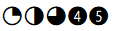
    0 confirmations: Question sign 1 confirmation: Empty (white) clock, with a black line showing north (I would interpret that normally as zero, like on a analog speed meter) 2 confirmations: Clock "15 min" past (quarter of the clock black) 3 confirmations: Clock "30 min" past (that is correct) 4 confirmations: Clock "45 min" past, see screenshot 5 confirmations: Clock "60 min" past 6 confirmations: Check sign

    Screenshots

    Here a screenshot of the clock symbol for a transaction that got 4 confirmations bildschirmfoto

    Version 0.15.0.1

    Some additional words

    I admit, that this is really a nit, nevertheless maybe someone thinks, that this could be improved, too (and has capacity to do that). I know, contributors have really more significant work to do, and I appreciate Your work very much!

    Edit: Tried to make my (really trivial?) point more clear, hopefully

  2. TheBlueMatt commented at 9:47 PM on October 30, 2017: member

    Confirmations are not linear - it's much, much, much more likely for you to see a one block reorg than a 2, and same for further numbers. If anything the logo nonlinearity could be increased, IMO.

    On October 30, 2017 2:39:28 PM EDT, wodry notifications@github.com wrote:

    Transaction confirmation counter "clock" symbol does not visualize

    proportional

    The "clock" does not show the proportional share of confirmations of the expected to be safe value of 6 confirmations (expected to be 60 min). It would be clearer for the user, if one could read the proportional value of confirmations directly and correctly from the clock.

    Expected behaviour

    When less than six, the transaction confirmation counter "clock" symbol should show the proportional share of 60 min: 2 confirmations: 20 min past 4 confirmations: 40 min past 5 confirmations: 50 min past

    Actual behaviour what clock symbol shows:

    2 confirmations: 15 min past 3 confirmations: 30 min past (that is correct) 4 confirmations: 45 min past, see screenshot 5 confirmations: 60 min past

    Screenshots

    Here a screenshot of the clock symbol for a transaction that got 4 confirmations bildschirmfoto

    Version 0.15.0.1

    Some additional words

    I admit, that this is really a nit, nevertheless maybe someone thinks, that this could be improved, too (and has capacity to do that). I know, contributors have really more significant work to do, and I appreciate Your work very much!

    -- You are receiving this because you are subscribed to this thread. Reply to this email directly or view it on GitHub: https://github.com/bitcoin/bitcoin/issues/11581

  3. meshcollider commented at 11:02 PM on October 30, 2017: contributor

    I've always thought of that icon as more of a circular progress meter, not a clock, it fills up one step at a time with each confirmation

  4. fanquake added the label GUI on Oct 30, 2017
  5. ghost commented at 1:46 AM on October 31, 2017: none

    Text updated. Hopefully, now more clear what I mean...? @MeshCollider Yes, but this is not the case, since 1 confirmation is shown as 0 progress.

  6. TheBlueMatt commented at 1:57 AM on October 31, 2017: member

    It's possible the concept of "Bitcoin confirmations" doesn't map well to UX elements like progress bars and circles. Indeed, one might expect it to move at some constant rate (though that's also not gonna happen due to natural variance), but then maybe we should use some other element that shows security of a transaction increasing exponentially in some human-understandable way?

    On October 30, 2017 9:47:05 PM EDT, wodry notifications@github.com wrote:

    Text updated. Hopefully, now more clear what I mean...?

    -- You are receiving this because you commented. Reply to this email directly or view it on GitHub: https://github.com/bitcoin/bitcoin/issues/11581#issuecomment-340635301

  7. jonasschnelli commented at 6:46 AM on November 1, 2017: contributor

    I think @wodry has a point here. Also agree with @TheBlueMatt that the security you get with each confirmation is not linear. Though, I'm not sure if that must be transported on the UI (ideally it could, but more or less orthogonal to this issue). The UI does only count/display the amount of confirmation not the amount of security (the non-linear part), the later is currently up to the users definition (which indeed is not ideal).

    The problem with the UI is that the 10min, 20min, 40min, 50min icon would look worse on non HiDPI screens.

    PRs welcome.

  8. MarcoFalke commented at 3:31 PM on November 1, 2017: member

    I think the symbol represents that a transaction ages as it "collects" confirmations. The "clock" symbol is based on the stopwatch icon and does not necessarily represent a time of exactly 60 minutes. Imo it should be interpreted that "more black" means "older" transaction and as @jonasschnelli suggest it is not worth to mess with the look and feel on non-hidpi screens.

  9. MarshMallowMan commented at 3:57 PM on November 28, 2017: none

    clock symbol suggestion 
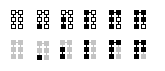
what if we were to make confirmations 1-5 look like the above picture instead? So 4 and 5 being a full back circle but with a number in it to represent the confirmation number. They are all under "Segoe UI Symbol" Font.

  10. luke-jr commented at 6:30 PM on November 28, 2017: member

    Proportionality (current) makes more sense than a clock. Blocks are not evenly spaced every 10 minutes, and there are scenarios where we really ought to ignore blocks toward confirmations (although we don't yet).

  11. MarshMallowMan commented at 8:53 PM on November 28, 2017: none

    block icon suggestion 
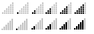
If we should stay away from clock-type icons. What about using something like a signal strength icon with 6 bars. Could also separate those bars into blocks so it looks like your stacking blocks. Like the above picture

    Could also do icons that look more like a chain of blocks block icon suggestion2

  12. MarcoFalke commented at 9:23 PM on November 28, 2017: member

    Please no "signal strength" to count the number of confirmations and if you go for the blocks icon, the number of blocks must match the number of confirmations. Everything else would be confusing.

  13. jnewbery commented at 9:23 PM on March 27, 2018: member

    I have no strong opinion here. @wodry's initial suggestion seems sensible at first glance, but @TheBlueMatt has a very good point that security in non-linear, so any visual cue that gives the impression of linearity gives users the wrong intuition about confirmation security.

    Unless anyone has a concrete proposal for how we should change this, and they can get consensus to implement it, I suggest we close this issue.

  14. MarcoFalke closed this on Mar 27, 2018

  15. MarcoFalke locked this on Sep 8, 2021

github-metadata-mirror

This is a metadata mirror of the GitHub repository bitcoin/bitcoin. This site is not affiliated with GitHub. Content is generated from a GitHub metadata backup.
generated: 2026-04-17 15:15 UTC

This site is hosted by @0xB10C
More mirrored repositories can be found on mirror.b10c.me