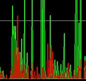
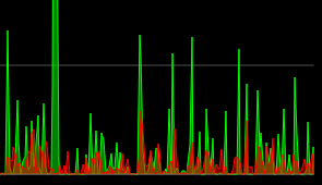
Before:

After:

Before:

After:

64@@ -65,6 +65,7 @@ void TrafficGraphWidget::paintPath(QPainterPath &path, QQueue<float> &samples)
65 void TrafficGraphWidget::paintEvent(QPaintEvent *)
66 {
67     QPainter painter(this);
68+    painter.setRenderHints(painter.renderHints() | QPainter::Antialiasing);
You can change render hints at any time.
Anyway, you can simplify this:
0painter.setRenderHint(QPainter::Antialiasing);
You can, but should you?
Your suggestion is good, pushing.
You can, but should you?
It depends if fillRect is faster without antialiasing - in this case it might make no difference as the rect is aligned and fills the entire surface.
More generally when you “paint/compose” an image you might want some parts/primitives antialiased and others not.
Concept ACK. Can you check if rounded join style looks better? See https://doc.qt.io/qt-5/qpen.html#join-style.
That is a different part of the code. I can’t really see the difference, probably because the points are too close. It looks like this:

I can push the change anyway.
 0diff --git a/src/qt/trafficgraphwidget.cpp b/src/qt/trafficgraphwidget.cpp
 1index 97a8599fb..4c245ad0c 100644
 2--- a/src/qt/trafficgraphwidget.cpp
 3+++ b/src/qt/trafficgraphwidget.cpp
 4@@ -109,14 +109,18 @@ void TrafficGraphWidget::paintEvent(QPaintEvent *)
 5         QPainterPath p;
 6         paintPath(p, vSamplesIn);
 7         painter.fillPath(p, QColor(0, 255, 0, 128));
 8-        painter.setPen(Qt::green);
 9+        QPen pen(Qt::green);
10+        pen.setJoinStyle(Qt::RoundJoin);
11+        painter.setPen(pen);
12         painter.drawPath(p);
13     }
14     if(!vSamplesOut.empty()) {
15         QPainterPath p;
16         paintPath(p, vSamplesOut);
17         painter.fillPath(p, QColor(255, 0, 0, 128));
18-        painter.setPen(Qt::red);
19+        QPen pen(Qt::red);
20+        pen.setJoinStyle(Qt::RoundJoin);
21+        painter.setPen(pen);
22         painter.drawPath(p);
23     }
24 }
If I have time I might play a bit with the whole graph to make it better though. That was initially my idea but this fix was simple and looks much better :)
That is a different part of the code. I can’t really see the difference, probably because the points are too close. It looks like this:
Thanks for testing, I’ve also checked it.
I think this is a nice improvement and it doesn’t take more CPU to be that noticeable (measured in macos with instruments with and without this change).
Other visual improvements are possible but this is fine as it is. ACK a89c808.
https://doc.qt.io/qt-5/qpainter.html#rendering-quality:
The
QPainterclass also provides a means of controlling the rendering quality through itsRenderHintenum and the support for floating point precision: All the functions for drawing primitives has a floating point version. These are often used in combination with theQPainter::Antialiasingrender hint.
Could using of floating point versions for drawing primitives (e.g., QLineF) be considered?
Gitian builds for commit 5d2ccf0ce9ca1571c650a69319fb9c1e0b626ecb (master):
Gitian builds for commit 28af91115fb83010bf2675796bfd635766ecf537 (master and this pull):
@JosuGZ I still think you should enable antialiasing only on L106 (I’ve tested it), this way the grid is always crisp - you can see on your screenshots that the horizontal lines are blurred and a bit darker.
Good catch, I think I agree, anti-aliasing improves diagonal lines but for axis-aligned lines (and the grid is that, by definition) it can make it look blurrier for no good reason.
@JosuGZ at least please reply to the comments (even if you disagree)
Hi, I haven’t been on my Linux machine these days so I was waiting for that.
About horizontal and vertical lines: I think it is pointless to disable it as I don’t think performance should be an issue, and sometimes lines fall between 2 pixels (if using floats, which I recall it has been mentioned). I could do it though. Same for enabling antialiasing after filling the rect with black, this one at least does not add complexity.
When I’m on it I will review a little more and I will comment.