Visual improvement across PC/MAC/Unix versions #16318

issue NicolasChoukroun opened this issue on June 30, 2019
  1. NicolasChoukroun commented at 2:43 PM on June 30, 2019: none

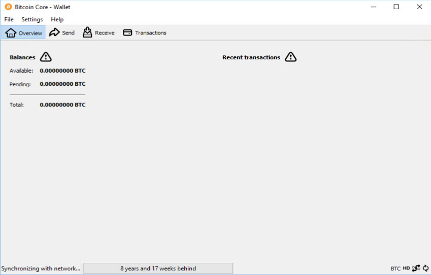
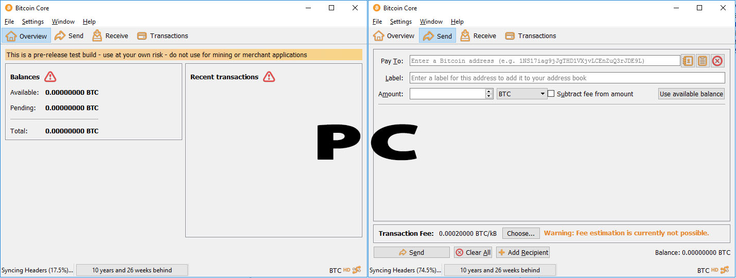
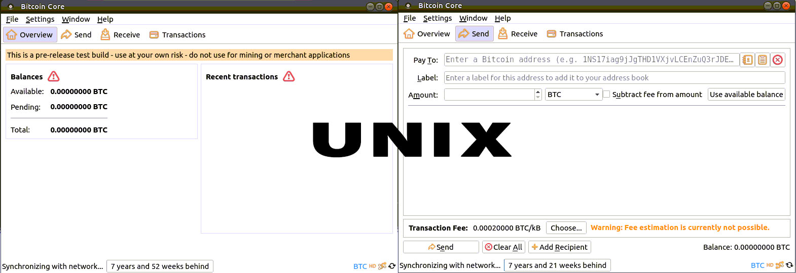
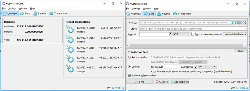
    The PC version of the wallet is monochrome, and the frames are not showing. The Wallet on Unix is the one looking best with the blue icons.

    I have fixed these problems while working on the Kryptofranc, and I would like to update Bitcoin to be consistant across the desktop versions.

    Here is what the PC wallet is looking right now.

    old-bitcoin-wallet

    And that's how it will look after.

    new-wallet-800

    (sorry for the KYF stuff, the only changes are the frame and the icons)

    The modifications are minimum. /src/qt/forms/overviewpage.ui Has to be modified so that the frames are visible not only on Unix.

    Otherwise it is just a pre-colored set of icons. They are compatible with the ones used today, that means that my tests are not showing a noticeable difference on Unix and MAC

    The new icons are replacing all the current monochrome PNG icons located here: /src/qt/res/icons/

    Windows though which is the most used version is in my opinion much better.

    Let me know if you want that I push these to master.

  2. fanquake added the label GUI on Jun 30, 2019
  3. jonasschnelli commented at 9:20 AM on July 3, 2019: contributor

    No strong opinion.

    I think we intentionally keep the UI minimalistic due to the flexibility of themes/operating systems we want to reach.

    A better UX would require someone really working on that. Also, since we are not (and don't want) using HTML/web technologies for the frontend display, designing a nice UI takes more effort than people think.

  4. NicolasChoukroun commented at 10:17 AM on July 3, 2019: none

    I think that you misunderstand the issue. The issue is not to improve the UI, it is to make it consistant on all the platform.s The current UI on windows does not have colors, does not have frames. It is the most used wallet. The Unix one has colors and has frames. MAC version does not have color but not have frames.

    Basically my changes will make the wallet identical on all the platforms. That means looking like the Unix version on all the version.

    I think it is a very important update, look at what the look of the UI for windows. Did you run a windows wallet once? it is awful.

  5. ryanofsky commented at 5:14 PM on July 3, 2019: member

    Basically my changes will make the wallet identical on all the platforms.

    Where are these changes? Is there a PR open? This sounds like a good idea, depending on the details. You may want to see https://github.com/bitcoin/bitcoin/blob/master/CONTRIBUTING.md#contributor-workflow if you are unfamiliar with the process for submitting changes.

  6. fanquake added the label Brainstorming on Jul 5, 2019
  7. promag commented at 2:24 PM on July 5, 2019: member

    Regarding the color I agree with @jonasschnelli, I think monochrome is the best option.

    Personally I don't like (too many) frames/boxes, working out spaces/paddings/margins and fonts could give a better UI.

    The icons could be improved to be more light/thin IMO.

    Let me know if you want that I push these to master.

    You only have to push to a branch in your fork then let us know.

  8. NicolasChoukroun commented at 4:34 PM on July 5, 2019: none

    Fork that includes the changes, based on current master: https://github.com/NicolasChoukroun/bitcoin

    Sorry for the delay, I have reworked the icons. The wallet should look the same apart some small details that could be fixed later (like the BTC in the icon bar at the bottom)

    The main changes are:

    • same color for the Icons across the board (Unix, PC and MAC)
    • PC version now looking as cool as the Unix version.
    • Icon color fixed with Bitcoin logo color on all version, all OS and all local Palettes.
    • Text, and background untouched, other styles untouched.
    • Forms are the same, no change in the UI apart some frames that were not showing for PC.

    Reminder: here is the wallet on PC right now. image

    After the change, it is looking like this. bitcoinpc01 bitcoinunix01

    Let me know if you want me to change anything. Also let me know if I did a mistake in the way I introduced this change, I am new, it is my first submission.

  9. JosuGZ commented at 9:43 AM on July 23, 2019: contributor

    I think it is a very important update, look at what the look of the UI for windows. Did you run a windows wallet once? it is awful.

    Awfulness is a very subjective matter. I don't like the frames, but I agree that something should be added. I like the elevation concept of Android, or some kind of "cards".

  10. laanwj commented at 11:21 AM on September 30, 2019: member

    I like the simple, monochrome icons. The 3D-ish shadowed icons seem a bit 1990'ish to me, personally.

    For some perspective: this is serious, safety critical software, with potentially millions of dollars irrevocably at stake for a single wrong action. Having "a cool GUI" is not an aim. Like with industrial GUIs, boring is fine. The main aim of the GUI is to make common tasks easy and to prevent mistakes.

    So for those wanting to improve the UI: please work on accessibility, usability and such.

  11. MarcoFalke commented at 12:36 PM on September 30, 2019: member

    There seems to be disagreement about those "visual improvements", so I am closing this for now.

  12. MarcoFalke closed this on Sep 30, 2019

  13. DrahtBot locked this on Dec 16, 2021

github-metadata-mirror

This is a metadata mirror of the GitHub repository bitcoin/bitcoin. This site is not affiliated with GitHub. Content is generated from a GitHub metadata backup.
generated: 2026-04-21 18:14 UTC

This site is hosted by @0xB10C
More mirrored repositories can be found on mirror.b10c.me