This PR adds a better icon for the Open URI button. This icon is more common for a URI.
<br>
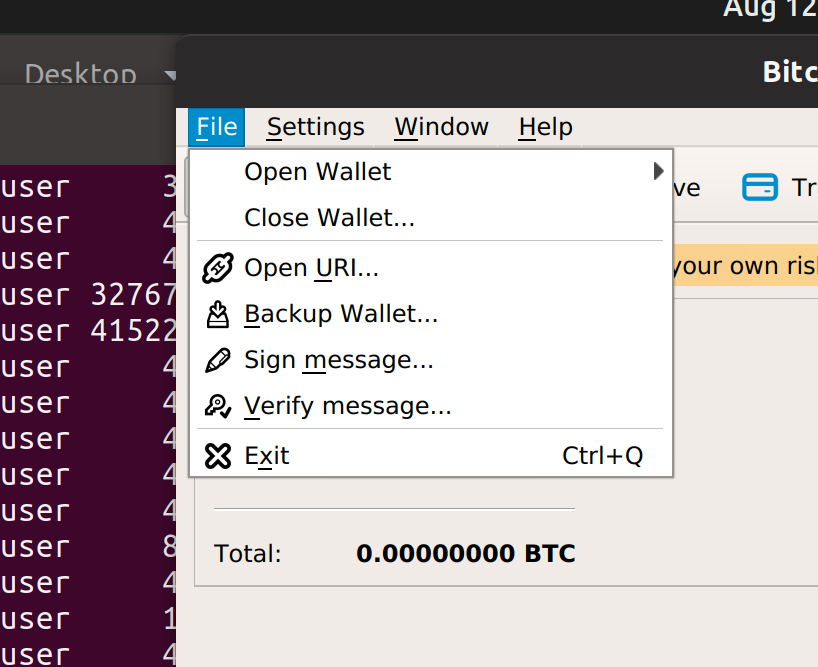
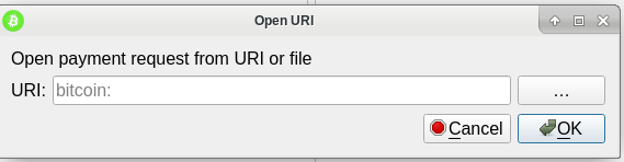
In action it will look like this:

qt: Add better icon for Open URI #16541
pull emilengler wants to merge 3 commits into bitcoin:master from emilengler:2019-08-qt-update-open-uri-icon changing 1 files +0 −0-
emilengler commented at 8:55 PM on August 2, 2019: contributor
- fanquake added the label GUI on Aug 2, 2019
-
MarcoFalke commented at 10:20 PM on August 2, 2019: member
I'd rather stick with the https://www.s-ings.com/typicons we currently use.
-
emilengler commented at 10:47 PM on August 2, 2019: contributor
@MarcoFalke Good suggestion, I update it and the screenshot as well
-
6b7a487171
qt: Add better icon for Open URI
qt: Change icon to make it similar to other

qt: Change to outline link icon
-
hebasto commented at 12:23 PM on August 3, 2019: member
-
emilengler commented at 2:58 PM on August 3, 2019: contributor
Sure, take a look at qBittorrent for example. They have something similar for magnet URIs
-
hebasto commented at 3:22 PM on August 3, 2019: member
@emilengler Is the suggested icon optimized?
-
emilengler commented at 4:32 PM on August 3, 2019: contributor
@hebasto No not yet, will update it
-
qt: Optimize Open URI icon 5694b2b0cb
-
emilengler commented at 11:37 PM on August 3, 2019: contributor
@hebasto Done
-
laanwj commented at 5:18 AM on August 5, 2019: member
New icon looks okay to me.
-
jonasschnelli commented at 7:01 AM on August 5, 2019: contributor
Fine by me
-
promag commented at 10:23 AM on August 5, 2019: member
Looks like it should have more padding? I think it should have the same line width.
<img width="334" alt="Screenshot 2019-08-05 at 11 22 30" src="https://user-images.githubusercontent.com/3534524/62457751-56fc2d00-b773-11e9-89e0-9159ff1ddcb2.png">
-
MarcoFalke commented at 11:37 AM on August 5, 2019: member
Is there a reason we can't use the svg directly?
-
emilengler commented at 5:29 PM on August 5, 2019: contributor
@promag Yes there is more padding, I had no idea if there was one already. But in action you won't see the difference
-
jonasschnelli commented at 11:32 AM on August 12, 2019: contributor
Looks in general acceptabel. But the icon needs more padding to look not larger than the other ones.
-
emilengler commented at 11:44 AM on August 12, 2019: contributor
@jonasschnelli Ok, I will append it.
-
qt: Add padding to open.png 3c77c09770
-
emilengler commented at 3:21 PM on August 12, 2019: contributor
@jonasschnelli Done
-
kristapsk commented at 10:22 PM on August 13, 2019: contributor
I like this new icon better for "Open URI" context in menu, but dialog window itself actually has "from URI or file" and for generic "open" functionality that open folder icon is definitely more common (Transmission uses it for both file and magnet link menu items actually).
-
emilengler commented at 11:13 PM on August 13, 2019: contributor
Yeah I also had this in mind, the "..." can be replaced by the open icon
-
laanwj commented at 10:57 AM on August 14, 2019: member
Same comment as here: #16584 (comment)
Instead of a flurry of menu icon changes and associated bikeshedding, maybe remove them completely.
-
DrahtBot commented at 4:56 PM on August 14, 2019: contributor
<!--e57a25ab6845829454e8d69fc972939a-->
The following sections might be updated with supplementary metadata relevant to reviewers and maintainers.
<!--174a7506f384e20aa4161008e828411d-->
Conflicts
No conflicts as of last run.
-
emilengler commented at 6:05 PM on August 14, 2019: contributor
@laanwj See my comment in the issue you referenced to, Bitcoin should be accessible for anyone no matter of his education
-
hebasto commented at 6:31 PM on August 14, 2019: member
Bitcoin should be accessible for anyone no matter of his education
This way leads to frustration only, IMO.
-
- fanquake closed this on Aug 15, 2019
- emilengler deleted the branch on Aug 15, 2019
- bitcoin locked this on Dec 16, 2021