Fixes the confusing behavior reported in #15952


Fixes the confusing behavior reported in #15952

Mind attaching a screenshot?
@promag screenshot added

Concept ACK
 400 | @@ -400,6 +401,10 @@ void BitcoinGUI::createActions()
 401 |                      assert(invoked);
 402 |                  });
 403 |              }
 404 | +            if (available_wallets.empty()) {
 405 | +                QAction* action = m_open_wallet_action->menu()->addAction(QString(tr("No wallets available...")));
Unnecessary QString and ...
Concept ACK.

shouldn't it rather say something like "no additional wallets available"? IIUC wallets that are already open are not listed, so when you open the program with the default wallet and then it says "no wallets available", it might also be confusing
 369 | @@ -370,7 +370,8 @@ void BitcoinGUI::createActions()
 370 |          connect(openAction, &QAction::triggered, this, &BitcoinGUI::openClicked);
 371 |          connect(m_open_wallet_action->menu(), &QMenu::aboutToShow, [this] {
 372 |              m_open_wallet_action->menu()->clear();
 373 | -            for (std::string path : m_wallet_controller->getWalletsAvailableToOpen()) {
 374 | +            std::vector<std::string> available_wallets = m_wallet_controller->getWalletsAvailableToOpen();
 375 | +            for (std::string path : available_wallets) {

Could use const auto& path to avoid string copy.
utACK febd959a6aef9399d8a93b4476cf342217c35380. Code change looks good and this is less confusing than before. But it's still strange to have unloaded wallets listed in a menu on the left, and loaded wallets listed in a dropdown on the right, and no clear labeling of either list.
I think an improved UI would make the menu wallet list and the dropdown wallet list identical, and either show all wallets in the lists with clear loaded/unloaded labeling, or only show loaded wallets and move the list of unloaded wallets to a separate "Load wallet..." dialog.
Having the same wallets listed both in the file menu and dropdown would be redundant, but might be justified because the file menu is more discoverable and the dropdown menu is more convenient. We could drop one of the lists or move the list somewhere else like a top level Wallets menu.

<!--e57a25ab6845829454e8d69fc972939a-->
The following sections might be updated with supplementary metadata relevant to reviewers and maintainers.
<!--174a7506f384e20aa4161008e828411d-->
Reviewers, this pull request conflicts with the following ones:
If you consider this pull request important, please also help to review the conflicting pull requests. Ideally, start with the one that should be merged first.

Concept ACK
I think an improved UI would make the menu wallet list and the dropdown wallet list identical, and either show all wallets in the lists with clear loaded/unloaded labeling
👍
shouldn't it rather say something like "no additional wallets available"?
Agree, or just something like "All available wallets open."
~Thoughts on instead using "checked" menu items, showing all wallets and leaving a check next to the ones already loaded (which would be a no-op when clicked)?~ I like the greyed out approach
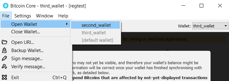
or maybe just gray out the ones already loaded?

tACK c3ef63a52f304a600fff1f9c7caa5cb804d41d43
Tested ACK c3ef63a52f304a600fff1f9c7caa5cb804d41d43
Milestone
0.18.1